
A Story of Food Globalization

It is a simple thing that we may not pay much attention to or that may have become normal in our everyday lives, but the food we buy at the supermarket comes from further and further locations across the globe. If we just think of the products we ate today, it would not be surprising that some were grown or manufactured on another continent. With the fast growth and democratization of transports, the food we eat everyday no longer depends on the local production but tends to come from various parts of the globe.
This has a lot of consequences that we are not always aware of. At a time when global warming is more than ever an actual issue, we can ask ourselves questions about the ecological impact of this phenomenon. Does food globalization have an important ecological footprint? But we can also ask ourselves about the health aspect, does this change in the way we feed ourselves has an impact on our health ? Using the Open Food Facts Dataset we will discover and analyze the various impacts of this food globalization.
The Data
![]()
The data used for this data story can be found on the Open Food Facts website. This is a collaborative, free and open database of food products from around the world. A great number of products are referenced in this dataset, along with informations about them like their origin, ingredients, nutrition score… Note that since that data is collaborative and maintained by users, some of it can be false or very biased. The raw data was cleaned as much as possible but some errors could still be present. We can show an example of this just by plotting the distribution of the number of products we have in our dataset per country.
Number of products in the dataset by country
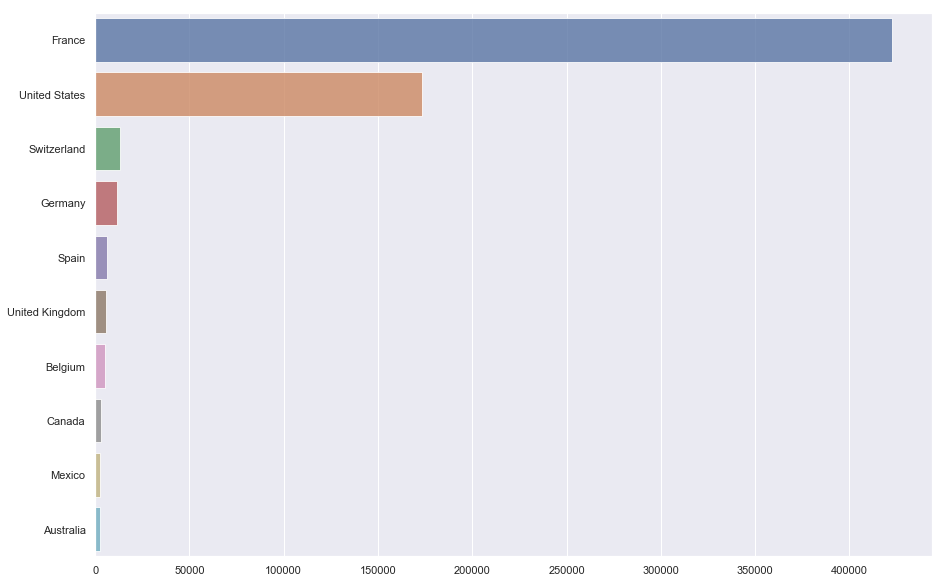
As we can see on the plot this dataset is largely dominated by French products followed by products from the US. This is due to the fact that this collaborative website from which the data was taken is french and visited mostly by french users. To talk about the effect of globalization the best case would have been to have data from all over the world but we can still manage to get interesting results by focusing our analysis on some of these beautiful countries like France!
We can also visualize this on a map to get a better feeling of how these product repartition is made. Here the log is taken because the number of products from France was too great compared to other countries.
Map of the number of products in the dataset by country (log visualization)
We see that most of the products are located in european countries like France or Switzerland. Also some countries like the United States, Mexico or Australia are represented. This is not the ideal case like we already said but this is a common thing to have unperfect data like this in the real world so we will work with it.
To be able to study the food through various aspects, we also used data from the World Bank website. These are statistics about countries like their GDP per capita or life expectancy, that we will use later in our story. We are now ready to begin our study. We start by trying to answer the first question that came to our minds : food products often travel hundreds or even thousands of kilometers before reaching our plates, what is then the environmental impact of this food globalization?
The environmental impact of food globalization
We start by the origins : before being transported and then consumed the food needs to be produced or manufactured somewhere. Where is somewhere will you ask ? Well we can discover that by drawing on a map all the locations from which the food in our dataset originates.
Cluster map of all places of origins present in the dataset
We can see on the map that the locations are more precise in Europe where the majority of our products are from, especially in France where there is a clear cluster of points of origins. As we saw previously, since most of our products are located in France this large number of French made products does not surprise us. We can also spot locations in North and South America as well as in Asia.
Globalization through the case of France
As we already saw France is the country which has the richest amount of data, of consumed and produced products in our data. This is why we now chose to focus on France as it is by studying specifically this country that we will get the most interesting results. A first step to observe the globalization would then be to look at where the food consumed in France come from.
Map of French ingredients importations
The first thing that surprises us on this map is that we have a whooping number of 87 different origin countries! The food that french people import not only comes from close european countries like we could expect but really comes from all over the world. Almost every continent is well represented and food can come from countries as far as New-Zealand. We see that, indeed, we can talk today about a globalization of food.
This map however does not tell us how much ingredients come from each country, therefore we now display a Bubble map where the circles are proportional to the number of ingredients originating from that country and sold in France. This will give us additional information about french importations and allow us to quantitize them.
Bubble map proportional to number of products with ingredients originating in the country
What we notice is that most of the imported products come from relatively close countries like Spain, Italy and the United Kingdom by a large margin. This is something we could have expected since the European Union favorizes the trade of food and products of agriculture among european countries. We still notice that there is a non-negligeable amount of products coming from other continents like Asia, America or Africa. We expect this quantities to be underestimated compared to the reality since our data is biased like we saw before.
We now know what quantities of products are transported to France and from where. It could now be an interesting idea to look at what kind of products are the most imported from these countries. We visualize these using WordClouds where the size of the name of a product is relative to the frequency it appears in the data. Hence the bigger a product appears, the most it is imported to France from this country. We take the case of Spain, Italy and United Kingdom as these three appeared previously to be the biggest exporters to France.
Spain
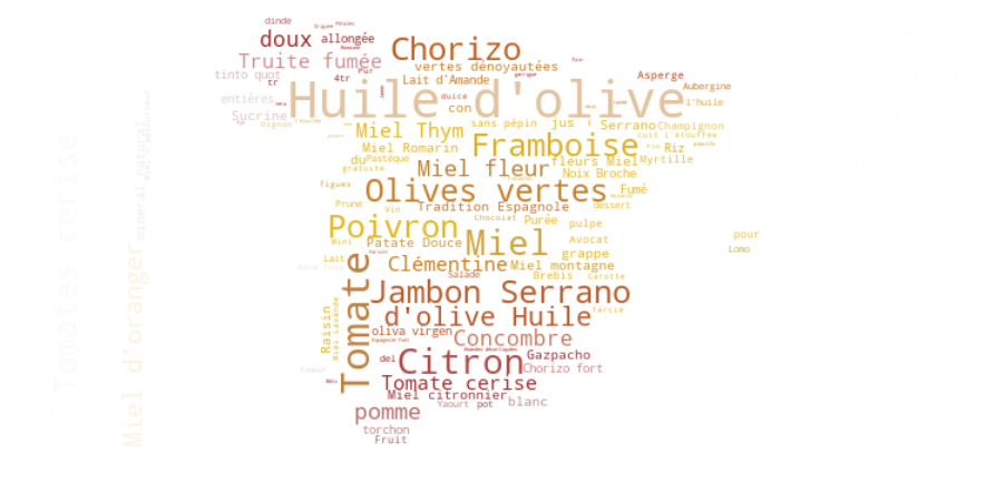
Here we see that these products consists mainly of olive extracts or fruits and vegetables, the most exported products being Huile d’olive (olive oil), Olives Vertes (green olives), Tomate (tomato), Citron (Lemon), Orange (well… oranges), Miel (honey), Framboise (cranberry). Other important products are some spanish specialities like Chorizo or Jambon Serrano (Serrano Ham).
Italy
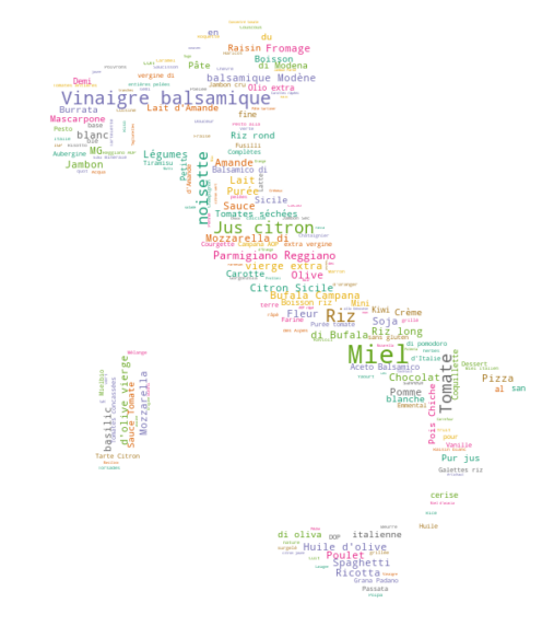
Here we also see prodcuts like Miel (Honey), Vinaigre balsamique (balsamic vinegar), Parmigiano Reggiano, Riz (rice), Pomme (apple), Jus de citron (lemon juice) but also some typically italian products like Pizza, Parmigiano Reggiano and Spaghetti.
United Kingdom
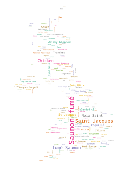
The products exported by the United Kingdom mostly consists of fish or seafood : Saumon fumé, Coquille Saint Jacques, Noix de Saint Jacques, but also alcohols like Whisky. These kind of importations makes sense given the geographical aspects of the United Kingdom, especially being surrounded by sea.
It is interesting to dig a bit on some of these products, especially fruits and vegetables, starting with olives:
Olives:
Based on its Wikipedia page, olives mainly grow on the coasts of the Mediteranean Sea.
Map of olives distribution
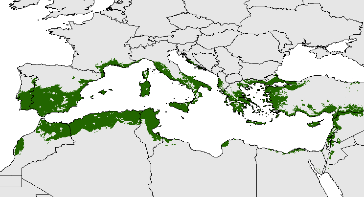
As we might know, olive oil is a main ingredient in a lot of recipes, and it definitely a main food component in French cuisine. But since we see that it doesn’t really grow in France, we understand the need for them to import it from neighbouring countries to satisfy the demand. We also see on the map that it grows on the majority of Spain.
Tomato:
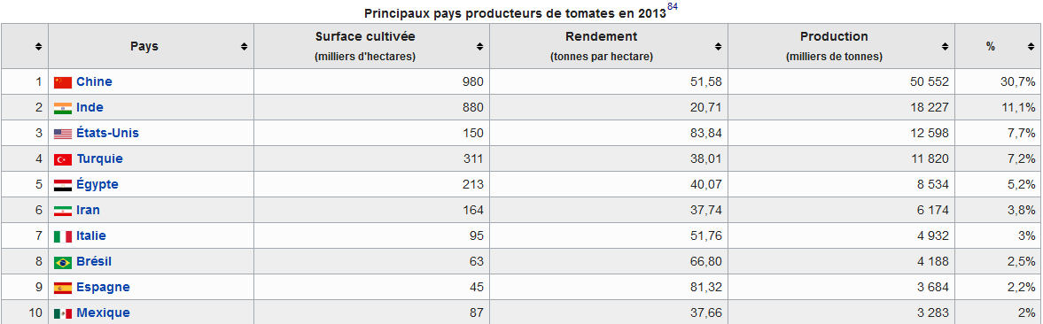
A quick look at its Wikipedia page also gives a good understand of why it is being one of the most imported food:
Spain and Italy being some of the biggest Tomato producers in the world :
While France is part of the biggests consumers worldwide :
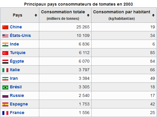
Other vegetables follow the same reasonment as the tomatoes, as Spain and Italy being important producers and France being an equally important consumer.
As it can be observed, most of the exported products from each of those three countries are signature products that show the identity of the country, its culture, and from which they are renowned. It also gives us insights on what type of bases those countries have in their traditional alimentation.
Now that we have a more precise idea about the food transportation across the world, where does it come from, to where, which kind of food, we can look at the environmental impact of all this transportations.
Environmental impact
In order to be able to eat food that is not produced in the country, it needs to be import it from the outside. As we saw before with the case of France most countries prioritize importations and exportations from the neighboring countries in order to reduce the ecological impact but also for practical purposes. However, sometimes these countries do not have another option than importing products from far away.
To compute the impact of this transportation we decided to make an estimation of the quantity of CO2 emitted. We decided to keep 0.023 kg per km and per gram of packaged used as a global approximation of the emitted quantity, since we do not have detailed information about the mode of transportation and path followed by each product we decided to consider all food is transported by air and the path is computed from the center of the exporter country to the center of the receiver. This is not meant to give a precise number of the emissions but rather to allow us to get an idea and a rough approximation of these.
Also as shown previously some countries have a larger amount of products in our dataset, this does not mean they import more, at least not in the way we could observe. That is why we decided to normalize the data and hence focus on how countries do import products, i.e do they import from far away countries or more locally?
First we see that the european countries seems to produce less C02 emissions on average from their food importations than the other countries. This can easily be explained because as we saw before, countries inside the European Union tend to trade large amount of food between them since it is a free market. Hence the food imported to countries like France, Germany or Italy mostly comes from “local” european countries, emitting less C02.
More isolated countries like the United States or China, known to be huge consumers seems to not produce enough and need to import products from further located countries. This is probably due to the fact that they have a large population concentrated in specific points and their production is also centered around specific products. Japan is a similar case, with a population over 100 million habitants their food production is limited to the space they can use. Most of the country is populated by mountains and forest and the production of food is very limited, forcing them to import big quantities of food to compensate it. They emitt more C02 than the previous countries. And shows that the estimations are reasonable.
The worst emitters seem to be some african countries like Cameroun or Guinée. The food production seems to be not enough and since the neighboring countries also lack production, they need to import bigger amounts of products from abroad and have then a bigger environmental impact. These are only interpretations and the observed results may also rely on other hidden factors. With more data we would have been able to get more accurate and trustable results. We need to take into account the fact that those countries are surrounded by countries we do not have data from, like the in Middle East, and thus it is probable that importation data from those countries is missing, making the only known come only from further countries, and thus increasing the average.
Food Societal Aspects
Now that we got an idea of the impact of food globalization on the planet we now can ask ourselves what impact it has on us. This is why we now try to see what are the societal aspects of food around the globe.
Before getting started we need to explain the notion of Nutrition Score: The Nutrition Score is a score given to an aliment to get an estimate of its global nutritional value and quality. It is obtained by performing an analysis of 26 positive and negative factors related to the food composition that are compared to the quantity of calories. The positive factors are those such as vitamins, minerals, proteins, etc. and the negative ones are those such as cholesterol, saturated fat, sugar, etc. This score in its french version is given as a final grade between letters A and E.
In order to quantify these grades in our study, we replaced these grades by scores between 1 and 5, 5 being the best score. This way we can compute means and averages and use these values. The nutrition score hence gives us an idea of the quality of the food. The higher it is the healthier the composition of the product is. It is a very interesting data that allow us study the relation between food and health.
Food quality and general health
We would first like to discover if for a given country the quality of the food that is consumed there can have an influence on the global health of this country. We represent on a world map the average nutrition score for products in a country (for countries having a sufficient amount of product with this data).
Map of the average nutritient score for products consumed in each country
Unfortunately we see that a large amount of countries do not have a sufficient amount of products with known nutrition score and thus they are represented in greyish colours. We still have a sufficient amount of data for Europe and see that globally nothern countries like Sweden or Netherlands seem to obtain a better average nutritient score than more southern countries like Portugal or Italy.
We can also visualize the distribution of the nutrition scores for the countries having the most Nutritient scores in the dataset. This will gives us a deeper intuition about the repartition of these scores.
Distribution of the Nutrition Scores for the 6 most represented countries
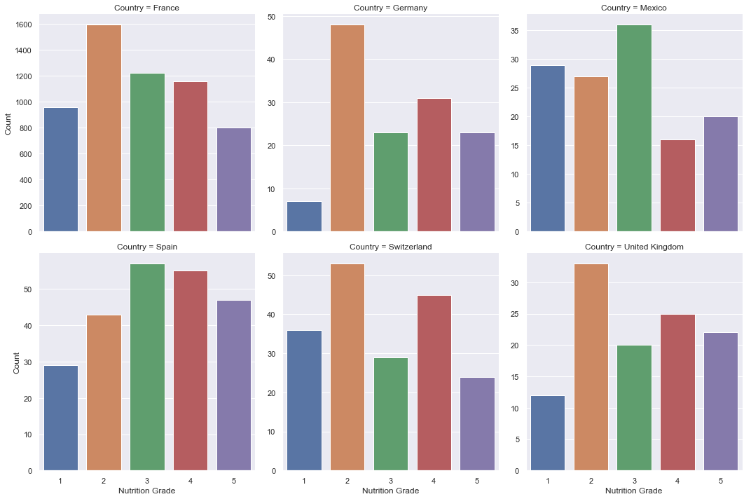
We observe that the distribution of these nutritient scores is far from uniform and changes a lot depending on the country. Hence we cannot make any assumption about the typical nutritient scores distribution (i.e. approximate it by a Gaussian distribution). Also some countries do not have much data, maybe we would had better results with more data.
We can still say that generally most products seems to have be of average nutritional quality, to have a grade between 2 and 4. Products of very good or very poor quality seems to be less present in comparison.
We can now try to answer our previous question with this data : does food quality have an impact on our health? We can try to analyze this by seeing if we can make any correlation between the average score of a country and its Life expectancy. A high nutritional score would indicate that a country has a better overall alimentation and the life expectancy is a good indicator of the global health of a country. This is why we now represent the life expectancy next to a normalized average nutrition score (for the countries for which we have available data).
Plot of the Average Nutrition Scores and Life Expectancy per country
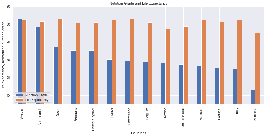
We observe that countries with low nutrition scores seem to have on average a lower life expectancy as it is the case for Romania. The countries with the highest scores nutrition scores, Sweden and the Netherlands, also have some of highest life expectancy of the set. This could suggest that there may exist some correlation between the two, but it is hard to tell for sure like that. This is why we now draw a scatter plot to visualize the dependency between the two and see if we can fit any interpolation.
Scatter Plot of the Average Nutrition Scores and Life Expectancy with interpolation
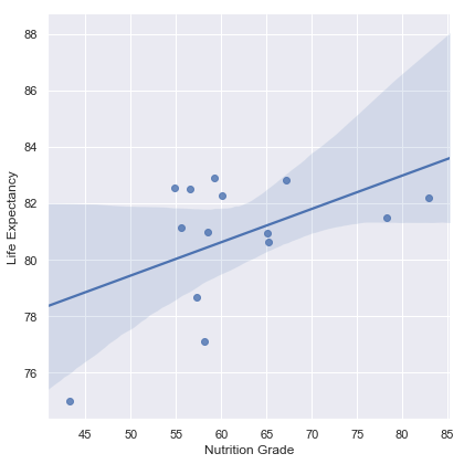
We see that an interpolation is effectively possible here. This shows that a correlation may be possible but it is still not completely sufficient to prove it. We would need more data to confirm or infirm this assumption. We also compute that their correlation score is of 0.502. This is a pretty high score given the amount of data and the error we have. We could hence say that the food quality can have an impact on the health of a country.
Finally the health impact on food can also be seen through the categories of products that are consumed. Here we take again the case of France and plot the distribution of the food that is consumed there.
Categories of food consumed in France
This pie chart shows the different distribution of aliments consumed in France. It shows that among the three most consumed aliments we have dairies and meals which do not delight on having the highest nutrition scores, due to their high amount of fat and saturated fat. This is probably one of the reasons why its average Nutrition Score is lower than Germany or Spain ones. The nutritionaly worst of all of them being the sugary snacks placed on 5th position.
We now display the distribution of the categories of food eaten in Switzerland to see if we do better than our neighbors.
Categories of food consumed in Switzerland
This time we can see that around a quarter is represented by sugary snacks and desserts which are the main reason why Switzerland has a low nutrition score even though being one of the most wealthy countries of Europe. Dairies represent too almost a quarter of the food products consumed in Switzerland. This food is also known to have a high percentage in fat and this also may contribute to the descent in the nutrition score, nutritionist recommend to consume low-fat dairies if possible and the nutrition score may tell us that swiss people tend to ignore this recommendations.
However, it is yet important to consider the fact that life expectancy can be lower in countries that have conflictive zones or where living requires work under extreme conditions.
We have seen that the food quality can have an impact on our health. We can now ask ourselves, could this lead wealthier countries to import and consume food of better quality?
Food quality and general wealth
We try to see if there exists any possible links between the average food quality and the global wealth of a country. If a country is reach enough to produce and import food of better quality will this be the case ? For this we again make use of the nutritional coefficient grades and the GDPs per capita for every country. We plot this data as a bar chart representing the GDP per capita for each country next to a normalized version of their average nutrition score and try to observe if we see any possible dependency.
Plot of the Average Nutrition Scores and GDP per capita per country
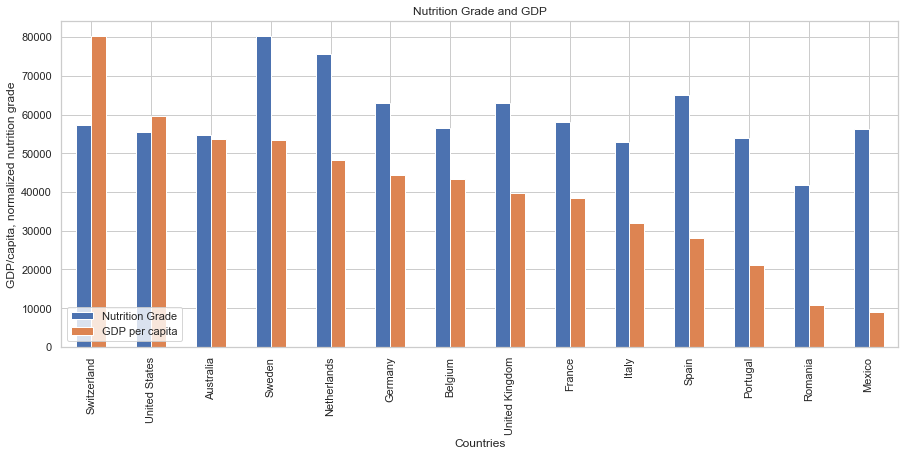
We observe that there does not seem to be any real correlation between the two data. Wealthy countries like Switzerland, the United States or Australia obtain worse grades than countries with a much lower GDP per capita like Spain or Mexico. This suggests that the wealth of a country does not seem to have any direct influence on the quality of the food that is eaten there. To make sure of that we try to make a scatter plot and see what be obtain.
Scatter Plot of the Average Nutrition Scores and GDP per capita with interpolation
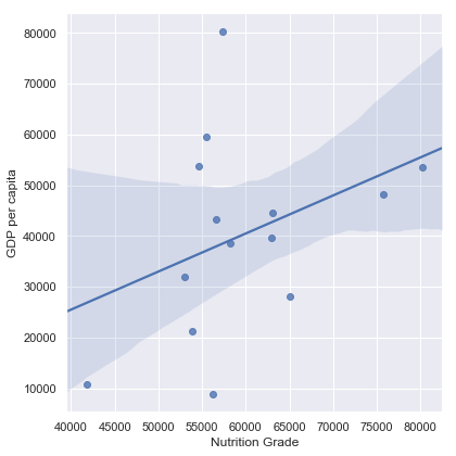
The scatter plot shows that an interpolation is possible but it is not as clear as the one we saw previously. We observe many outliers in the are of the 60000 and 80000 GDP per capita as well as in the 10000 area. The two data could be correlated but we need more data. We compute the correlation coefficient of this data and get a value of 0.373. This indicates a weaker correlation than previously.
An interesting we can notice is that most countries seems to have close nutrition scores averages even if they have very different GDPs per capita. Maybe food globalization has lead to this somewhat uniformity of food quality over the world. This seems to benefit to less rich country which still manage to have a good food quality and defavorises the wealthier country which still consume food of lesser quality when they could produce better, but this is subject to interpretation.
In conclusion we can say that it is not because a country can afford to produce and consume higher quality food that it will do it (i.e. the United States). There may still exist a correlation between the wealth and the food quality but it is not very obvious. More data would have been necessary to confirm this with more confidence.
Conclusion
As we saw throughout this story, food globalization has many aspects that impacts the world but also us. On the transportation and evironmental aspects the countries still seems to favorize importations from neighboring countries if they have the choice, otherwise the food they consume can travel thousands of kilometers before being eaten. This can have a serious impact on environment at a time when global warming is more than ever a topical question. On the health aspects, we saw that we can effectively talk about an impact of food on health. Countries which eat better seems to have a better overall health. Still we also saw through the economical aspect that it is not because a country is wealthier that it does eat better. The food quality is little influenced by the economy of a country. Rather globalization tends to an unifomization of this food quality around the world. The subject of food is very vast and there are still a lot of aspects that could not be developed in this story. Where will this food globalization lead us ? Only the future will tell us.
Thank you for your attention :)